created:1/23/2021
,updated:1/23/2021
Typescript Button
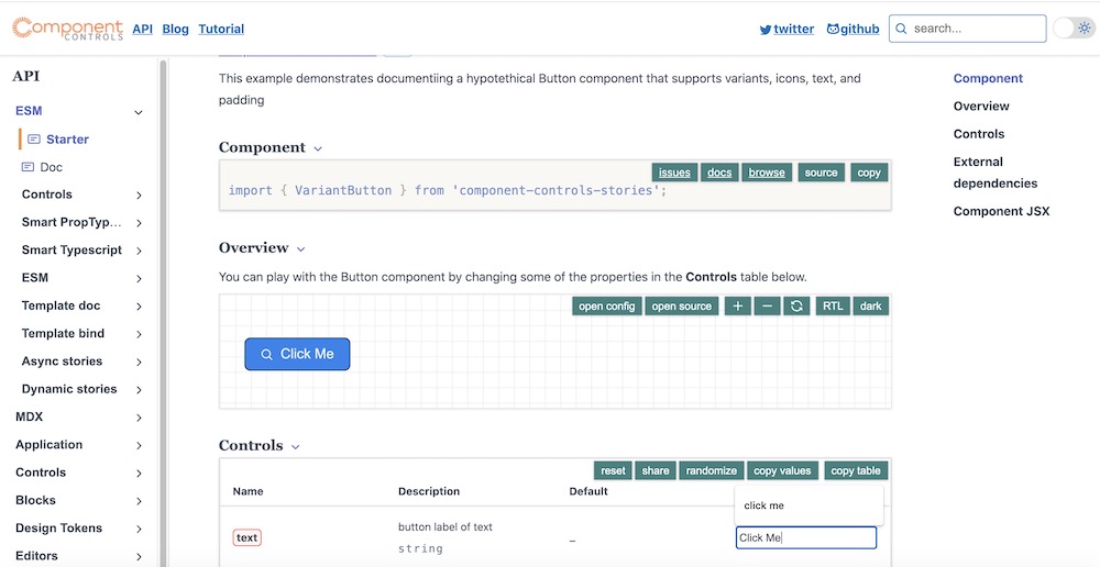
Button with react Typescript properties
- A button component with some text, optional icon, and variants
- primary for main, most important actions on secreen
- accent for less-significant actions
- disabled visually subdued
- success to indicate a successful process
- warning to indicate a process with potential issues
- error to indicate a process with an error
- The icons selected from @primer/octicons-react
- Allow for padding, fontSize and icon side configuration
- primary: #2F80ED
- accent: #9B51E0
- ...
- small: 5px 10px
- medium: 10px 20px
- large: 15px 30px
